Monday 18 March 2013

Final Focus Group

Final Focus Group Questions:

1. What is your ethnicity, age and occupation?
2. What do you like/dislike about my teaser poster?
3. What do you like/dislike about my main poster?

4. If you saw this DVD in a shop, would you (Honestly) consider watching it?
5. Do you like horror films?
6. Does the story-line interest you?

7. What interests you about my horror film campaign? 

8. If you could change one thing on any of my posters/DVD cover, what would you change and why? 


I asked 4 people these questions in hope for some positive and negative feedback in which I could use as evidence in my report.

I asked the following people:

Kira Sol
Louise Eyres

Gail Hubbard
Michael Moss


1: What is your ethnicity, age and occupation?

K: Caucasian, 43 and Wine Specialist. 


L: White British, 17, Student and part-time waitress.

G: White British, 55, Personnel Officer.

M: White British, 56, Retired.

2: What do you like/dislike about my teaser poster?

K: It's definitely a teaser that leaves you asking questions. Who, what and why is innocent? Are the claw marks from a hand that tried to claw as the body was dragged off or are they the murderers mark? It does make you want to know the scenario and hence perk up when you see more information on the main poster What are they coming for that is mine? 


LI like the hand print. I do like it, the colour scheme is nice.

G: I like the red colour and the style of the date. I like its layout and fits the conventions of a horror poster. 

M: It doesn't give very much away, but it tells me that it is quite a creepy film, the sub-title (tagline) and then the "coming soon" works well I like how you've connected the two. I think it could be brighter. 

3: What do you like/dislike about my  main poster? 

K: I do like the grey, white and black shading that screams out "spooky". Having the red as the only contrast colour stands out and sends a clear message of blood/violence from an unknown origin. That's very appropriate for any sort of horror flick. The bare trees implies winter/death, makes a subtle implication of whats to come. 


L: I like the picture, the font is a bit small but I like the actors and it looks quite professional. 

G: I like the shading and the background of the poster. I like the outline of the trees and the shadowing. Its not too creepy but still suggestive. 

M: I like how it appears. The shadowing effect and how the image fades out is very spooky. The title could be bigger but then it might block up too much of the design, and its all quite well proportioned. 


4: If you saw this DVD in a shop, would you (honestly) consider watching it? 

K: Yes I believe so. It intrigues me. 

L: Probably, it looks cool and quite creepy.

G: I don't like horror films, so no for that reason but it doesn't look too graphic like a lot of modern day horrors.

M: Maybe, I'd have to read more about it and see some reviews to see if it's worth watching. Judging it by its appearance, I would consider watching it. 

5: Do you like horror films?

K: Yes! They can be very interesting and brilliant if made correctly.

L: Only some, though I generally watch any. 

G: Not really, don't like the blood and guts. 

M: If there's a good story-line and not over the top amounts of graphic bloody scenes, then why not? 

6: Does the story-line interest you?

K: It does. I like these mystery films where the audience has to try and figure out things in the film, at least that's how this one appears to be. I'd certainly go for a film if it had a similar plot. 

L: Yeah, sounds a bit odd so I think it requires more information to fully understand it. 

G: I like the story-line, interests me and makes me want to see the film.

M: I would see it, though I don't like how the girl is killed/dead. Quite disturbing. 


7: What interests you about my horror campaign?

K: The great line up of actors! The fact its a mystery thriller film, I love a good psychological horror. Its main poster and the image on the DVD front is very well photographed and appeals to me. 

L: I like the appearance of the main poster and the way the title and taglines make the audience question what it could be about and what could happen. 

G: The posters are most effective, especially the main poster. It makes me want to go to and see the film and find out more about it.


M: Just seems like my kind of film. The posters are well done, the main poster seems like you took a lot of time on it. DVD cover seems realistic too. 
8: If you could change one thing on any of my posters/DVD cover, what would you change and why?

K: I may change the tag line as to us Americans, "the jury is out" is something very different to how the English interpret it haha.

L: Make it clearer as to what the story line is by maybe including a character on the poster or DVD? 

G: I would like to see possibly a character on one of the posters as then it gives more to the story-line. 


M: Change the story-line to something less depressing, maybe make it less focused on the children. 

Saturday 9 February 2013

Poster Designs


This was an idea that I played around with. I tried out different splatter and smudge effects but felt they were too false. The colour here is far too bright is unrealistic for the colour of blood. However I do like how the blood splat has almost worked as a border around part of the image. Though I feel it isn't quite serious enough and almost comical. 

After Editing, both the image and the typography, I layered both images onto one another by changing the opacity of the images, to make both layers more see through/transparent. 


Here, I added two blood splatters by using the brush tool and putting on smudges.

Next, I zoomed in closely to see the typography and added cracks to it. I also added another layer of the typography because I didn't feel the font was clear enough, it seemed too faded. By doing this, it has also created a shadow like silhouette glow around the writing, making it appear more 3D and more in the foreground.

I then added another blood splatter as I felt the top left of the poster was a bit empty and needed some colour. Red and black are typical colour conventions of Horror films and posters.


This is the final design and I have now included a tagline. This makes it more of a film poster instead of just a photograph. Personally, I feel it works quite well and fits the codes and conventions of horror films. 


This is the final design with the billing. I have removed the tagline because it didn't fit in with the genre, story-line or style of my poster. I am pleased with the billing although I feel there is a lot of it there. I am going to edit it again and insert a new tagline, as well as trying to make it more realistic looking. 


Finished complete main poster. 


Teaser Poster: 


This is the final design for my teaser trailer poster for my horror campaign. 


Edited the final design of the teaser poster and added some red blurs to create a blood effect. I will then add a tagline and then the teaser poster will be complete. 


Here I have changed the brightness of the image as when I printed it, it was very dark and you couldn't see the finger marks clearly at all. I will print this to see how well it comes out and hopefully it will be a lot easier to see. 


Changed Brightness, font and design.

Wednesday 6 February 2013

Photo's and Editing

Photo 1:


This is a photo I took when I was in Scotland during the Christmas Holidays. It is a shot through the car window, of Edinburgh Castle. 


This is the same photo cropped and being edited on Pixlr. I have only changed the brightness and contrast so far. By doing this, it makes the image appear more sinister due to the dark colours and dark sky, creating pathetic fallacy for the viewers. 


I have now changed the Hue and Saturation. I have done this to make the building almost more like a silhouette for the teaser poster background. I really like this photo and feel it is a possibility to use in my posters. Below, is the real photo of it, after editing.


For this stage of Editing, I have added a filter called 'Glamour Glow' I think it makes it a lot more effective, however I am unsure whether it is too cartoon like or not. 


Photo 2:


Again, this is a shot of Edinburgh Castle but from another angle. I really like how the building is above the camera and we as the audience are looking up at it. It makes us feel insignificant to its size. 


This is the photo being edited. I have changed the brightness so the sky isn't as blue and white, and changed the contrast to make the building a lot more darker and bring out the darkness in the brick work and hillside. 


In this photo, I have just changed it slightly by going over the building in the 'Blur Tool' this makes whatever you highlight in it go slightly faded/fuzzy. I like this effect however I am not too sure how I could use the photo in my posters.


Photo 3:


This is a photo I took when I was on a dog walk in Powdermill Woods in Battle. There is a small wooden bridge that you have to cross, and flowing underneath it is a little stream/river. This was during Autumn so the leaves were starting to fall off the trees and many settled on the surface of the water. I really like this photo and feel that by changing it slightly, it could look a lot more creepy. As I am doing Psychological Horror, I don't need or want to make all my photos gory, instead I want to show the scene and setting of the movie.


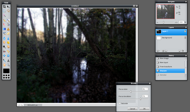
I have edited this photo simply by making it sharper. I used the sharpen tool and played around a bit with different filters and effects. I tried out the 'Denoise' filter but it didn't seem to change very much on this particular photo. I used the 'Tilt Shift' filter which in my opinion, gave a very good effect. It made the image very clear, but also seemed to darken it and blur parts, I changed the blur sections so I blurred it nearer the bottom. I wanted to make the river clear that it was there and so the way the light has come through the tree's and has been reflected onto the water makes it clear. 


This is the photo in its full size after being edited. 


Photo 4: 


This is a photo I took during our kitchen being rebuilt. This is in the garage and I really like how its captured all the dust and debris that has been left after the builders have removed and knocked down the walls and units. 


Here I have changed the Contrast of the image. By doing this it made all the dust and broken debris appear more bold and gave them better shadows. 


Next, I changed the Hue, Saturation and Lightness of the image. 


Wednesday 30 January 2013

Final Typography


Conventions of Psychological Horror

Psychological Horror films differ slightly from the stereotype of Horror.

Weapons- In psychological horror films, there isn't often a main weapon like a knife or a chainsaw. The killer generally plays more mind games and tricks to disturb the antagonist rather than physical weapons. 

Setting- Generally places that the audience can relate to. It makes it more realistic and the audience can then scare themselves as they begin to put themselves in the characters positions. E.g. woodland, large houses, abandoned buildings, isolated areas, hospitals, warehouses, schools, desolated towns/villages.

Characters- The antagonist is normally quite disturbed or twisted. They have often experienced something quite traumatic. Generally, the people who have been killed or harmed are innocent, and a majority are females as they are viewed as helpless, weaker, and in need of care. Children are also used in the main story-line to make the audience more sympathetic for them, and want to help them. By using Women and Children, it plays on the human instinct to want to help and protect them; as they cannot do that themselves.

Sound- Throughout horror films, the use of non diegetic sound is quite common, as tense and dramatic music is added to create tension and get the audience on the edge of their seat.This is sound that the characters cannot hear, and has been edited in.
The use of diegetic sound is where the characters can hear it too. This can be used when the characters are trying to be secretive and not get caught by the killer, or when they are loudly screaming and running away from the killer. 


Sight- The thing with psychological horror is that there isn't so much gore and physical violence, it is more to do with mind games and things that will stay in the audience's mind for a long time, even after they've watched the film. It exposes the audience as they are made to feel fear and vulnerability. There are often flashbacks to show the killers past, or what the antagonist is remembering.